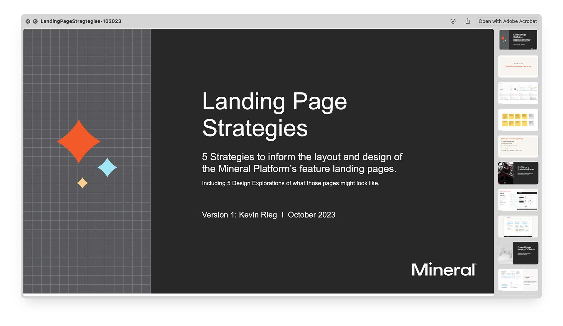
Above: My presentation ("Landing Pages" was the term we used internally to describe our product feature pages). In order to promote these UX improvements and gain buy in, I needed a clear and crisp showcase of why, what and how we can go about doing the work.
•••
Creating 5 strategies for a stronger yet flexible feature page template within the Mineral Platform.
Company
Mineral, Inc (Now part of Mitratech)
Role
Product Design Lead
Skillsets
Turning user feedback into improvement.
Leading design initiatives.
Introduction
Project Overview
The Mineral Platform is a web-based product designed to simplify HR and employee benefits compliance, allowing users to focus on running their business. While the platform offered powerful tools, features, and content, inconsistencies across pages created a fragmented and rigid user experience.
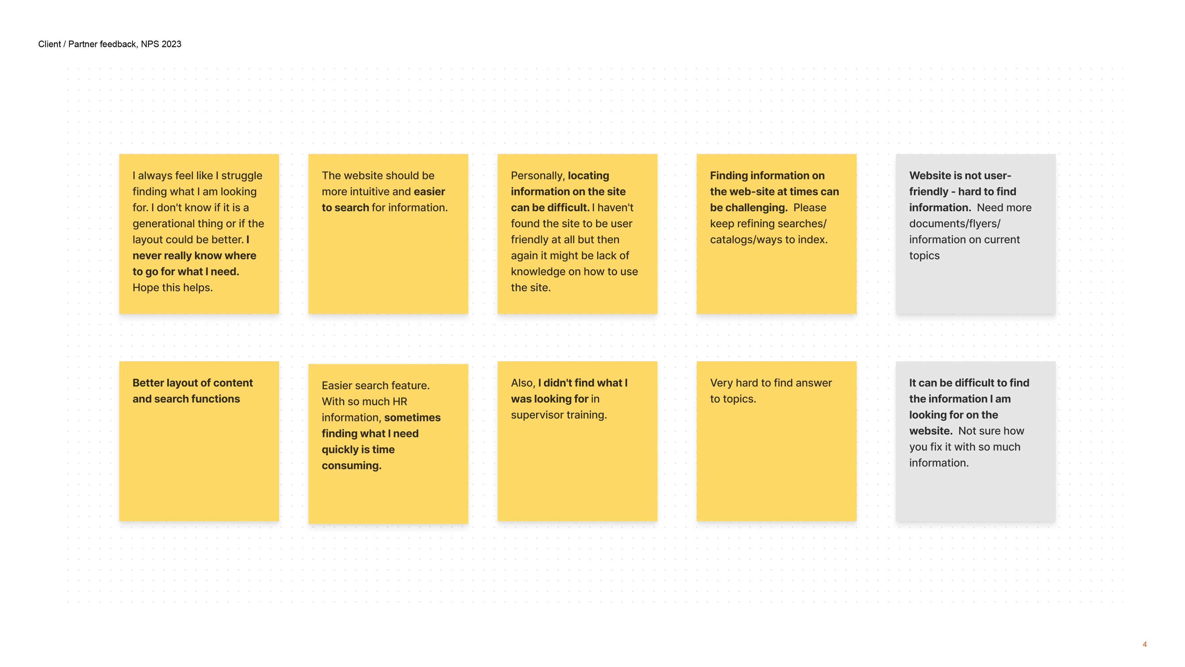
This insight wasn’t based on assumptions — it came directly from user feedback collected through our NPS (Net Promoter Score) survey (see above). Comments from customers and partners consistently highlighted one key issue: things were hard to find.
Why might things be hard to find?
👉 Inconsistent page design across introductory landing pages.
👉 Users were often first-time or infrequent visitors, paths to discovery weren't always obvious.
👉 The platform was feature-rich, though many of these features were built but rarely optimized, tested, or integrated effectively.
This case study focuses on developing a layout strategy that champions the user experience—improving how users navigate and familiarize themselves with the platform while addressing the need for consistent design.
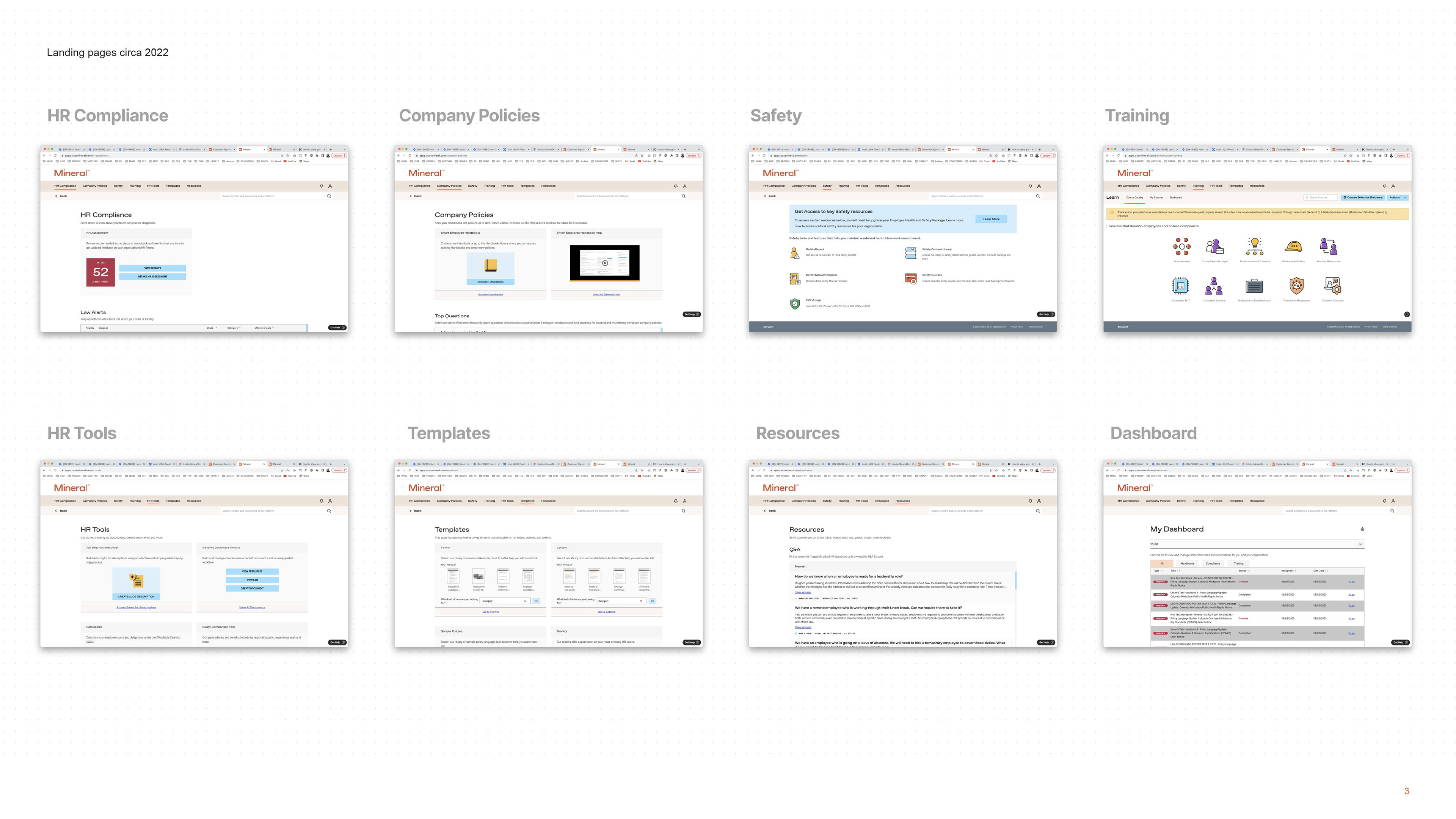
The eight screenshots below highlight clear inconsistencies. These pages serve as landing points for key product features in the primary navigation, yet they appear disjointed, with no unified starting points or strategic design. As Product Design Lead, I set out to resolve this by implementing five core strategies for landing page design.
5 Strategies for Landing Pages to Improve Find-ability, Consistency, and Ease of Use.
#1 - Put Things in Predictable Places
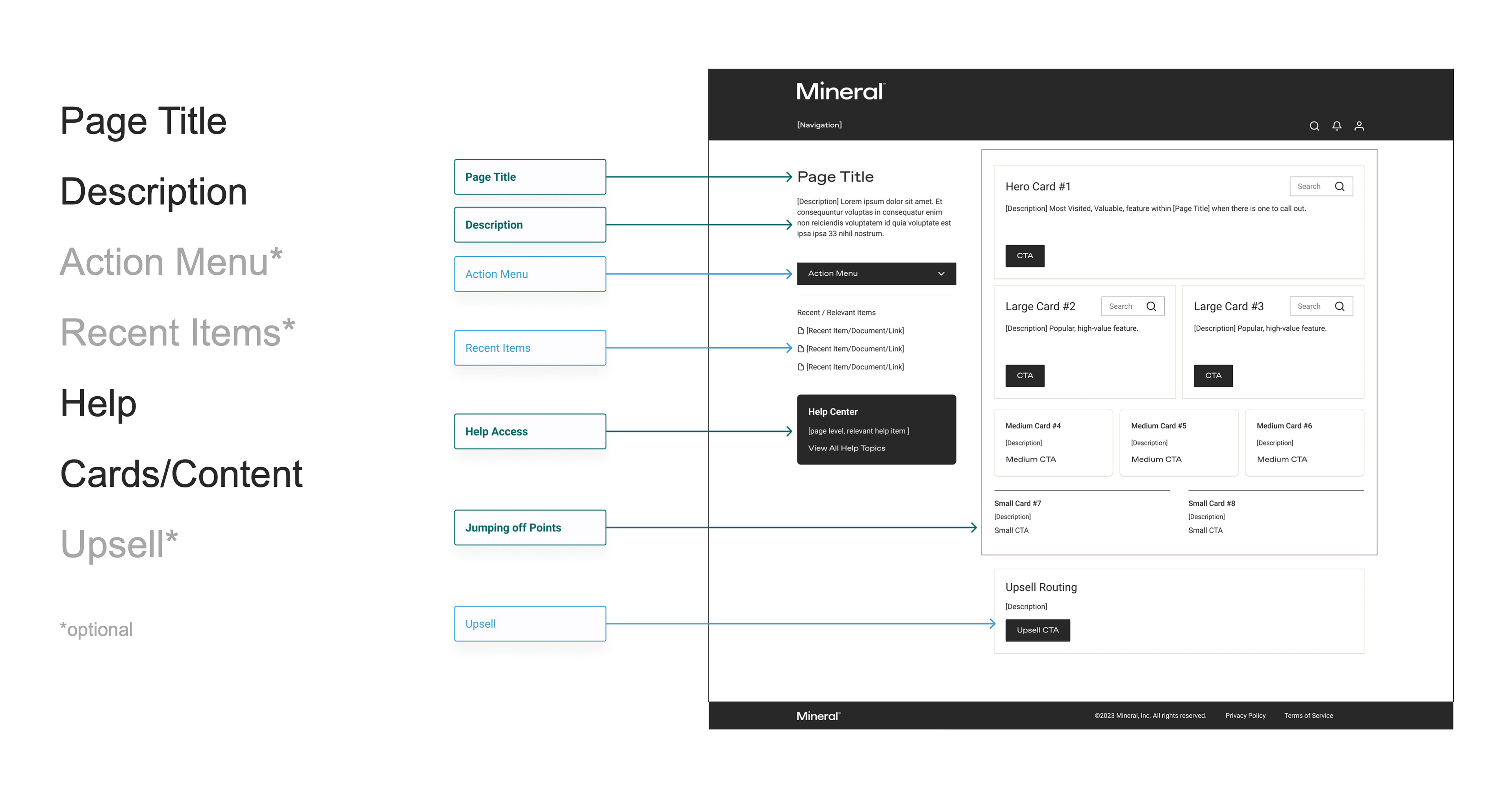
To create a seamless experience, each landing page should follow a consistent structure that users can rely on.
Essential Elements for Every Page: Page Title, Description, Help Section, Flexible Cards and Content.
Optional Elements: Action Menu, Recent Items, Upsell Section
In addition to a uniform header and footer, all elements should appear in consistent locations across pages. This approach ensures that first-time and infrequent users can easily navigate the platform, relying on a familiar layout to understand each feature.

#2 - Create Multiple Jumping-Off Points.
Empower users by offering multiple ways to start a task, giving them control and flexibility based on their experience level.
Landing pages should cater to both first-time users and returning visitors performing routine tasks by presenting several entry points that match their familiarity with the platform.
Examples of Starting Points:
Action Menus – Quick access to primary tasks.
Category Tags – Organized pathways for exploration.
Card-Specific Search – Direct navigation to relevant content.
This approach ensures users can engage with the platform in a way that feels intuitive, regardless of their experience level.
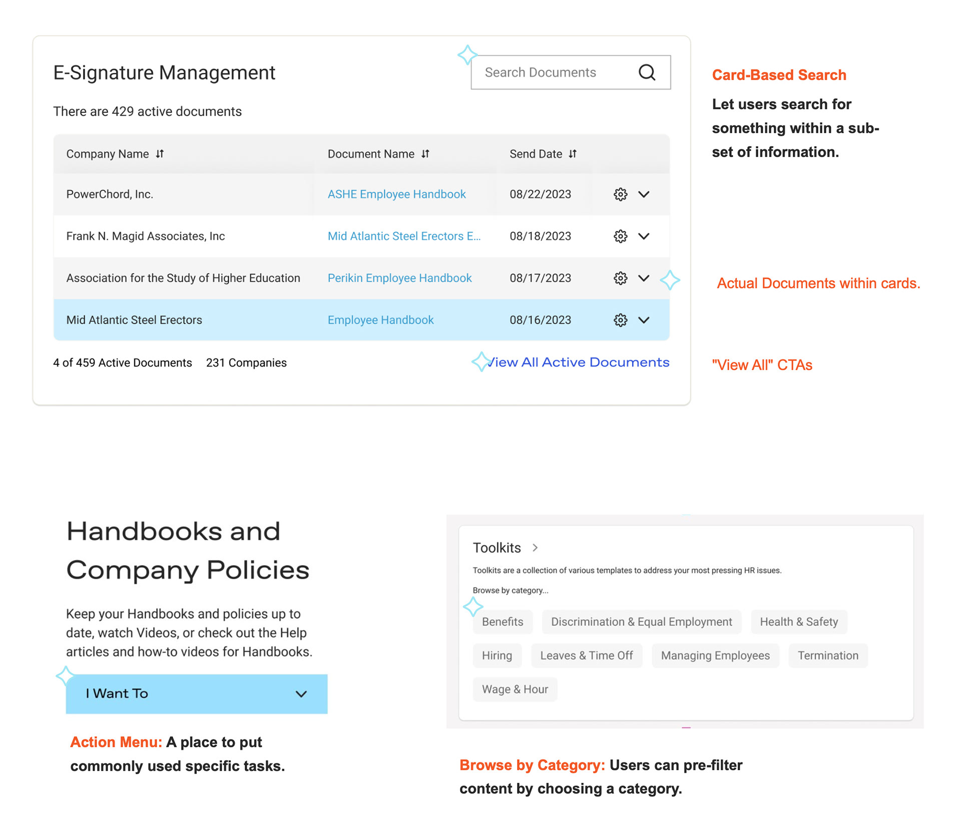
Above: Examples of components with various types of jumping off points. (These are not page designs)
•••

#3 - Use Strong Informational Hierarchy
Flexible Card Sizes for Visual Hierarchy
Design templates with interchangeable card sizes—hero, large, medium, and small—to create clear visual hierarchy. This allows landing pages to adapt based on content depth and can be customized to meet the needs of different user groups.
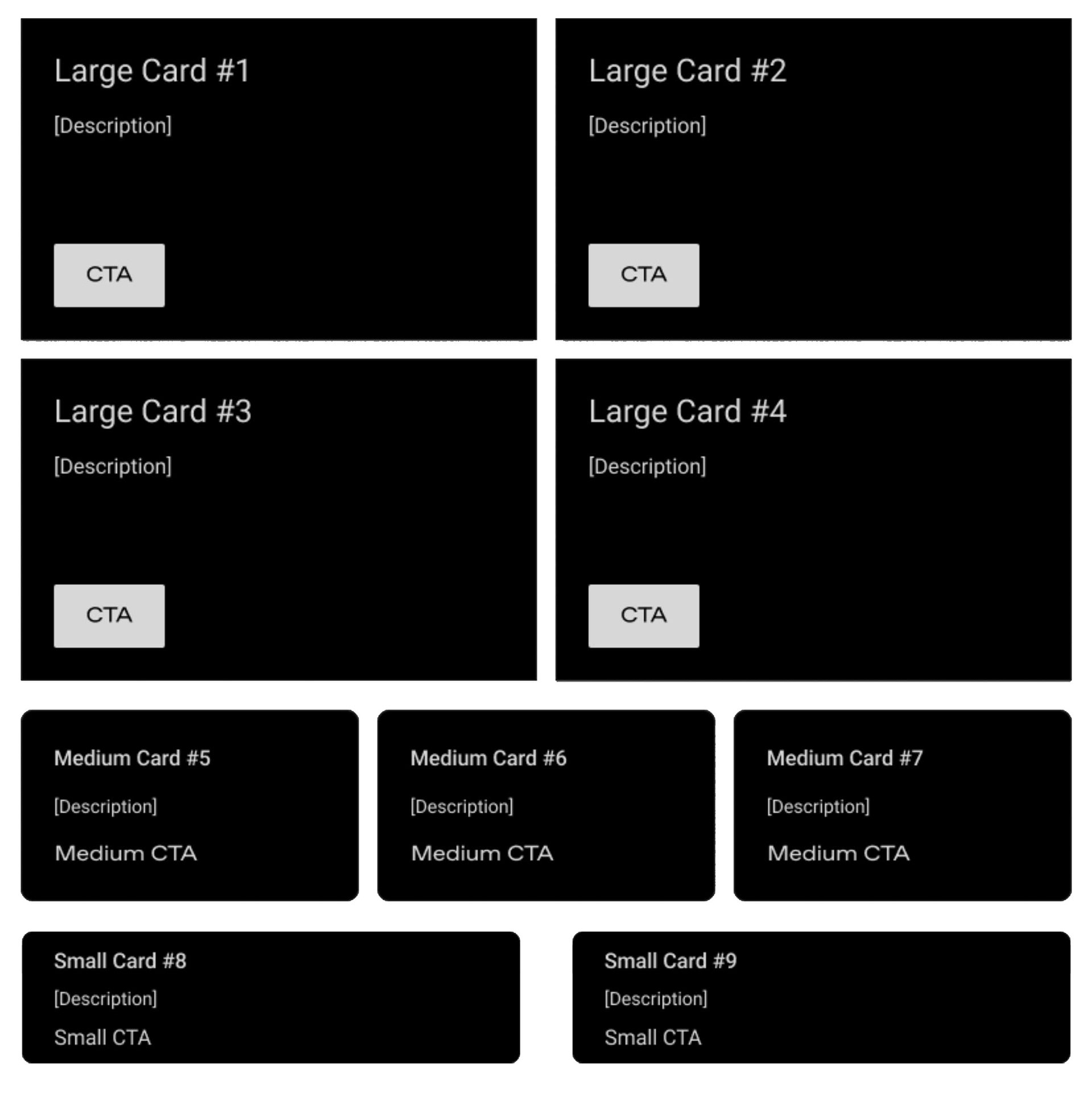
A wireframe showing a variety of card sizes that could be combined for any given feature and user relationship.
•••
Data-Driven Layout Decisions
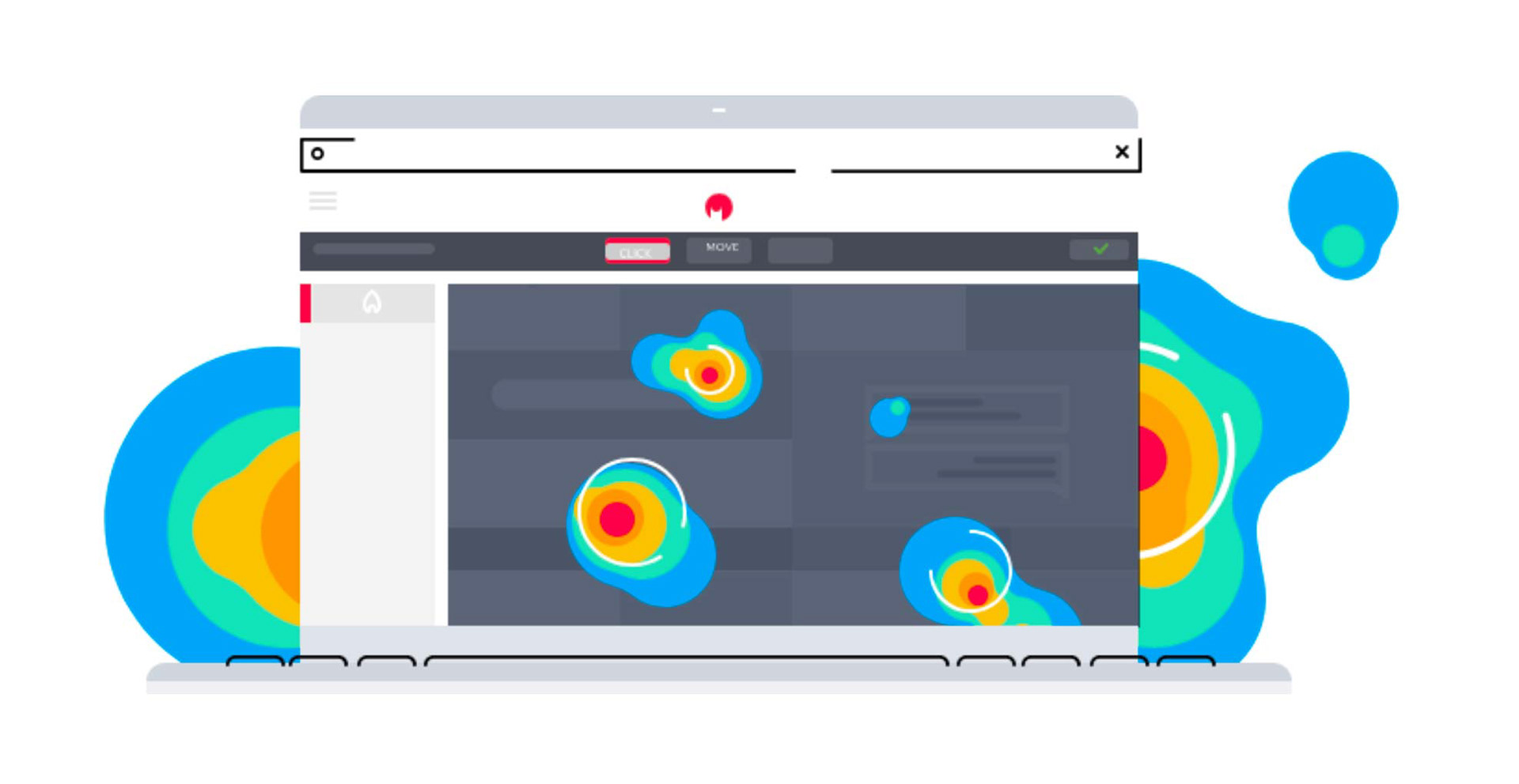
Inform layout choices using data from tools like Pendo and Hotjar. Prioritize frequently used features while minimizing visibility of less-used items. This reduces cognitive load and keeps landing pages clean and organized.
Inform layout choices using data from tools like Pendo and Hotjar. Prioritize frequently used features while minimizing visibility of less-used items. This reduces cognitive load and keeps landing pages clean and organized.
Streamline with Action Menus and Drop-Downs
Move less-used or secondary features into action menus or drop-downs. This conserves space while keeping key tasks accessible. Some items may appear both on the page and in menus, offering users multiple paths to the same action based on their preferences.
Move less-used or secondary features into action menus or drop-downs. This conserves space while keeping key tasks accessible. Some items may appear both on the page and in menus, offering users multiple paths to the same action based on their preferences.
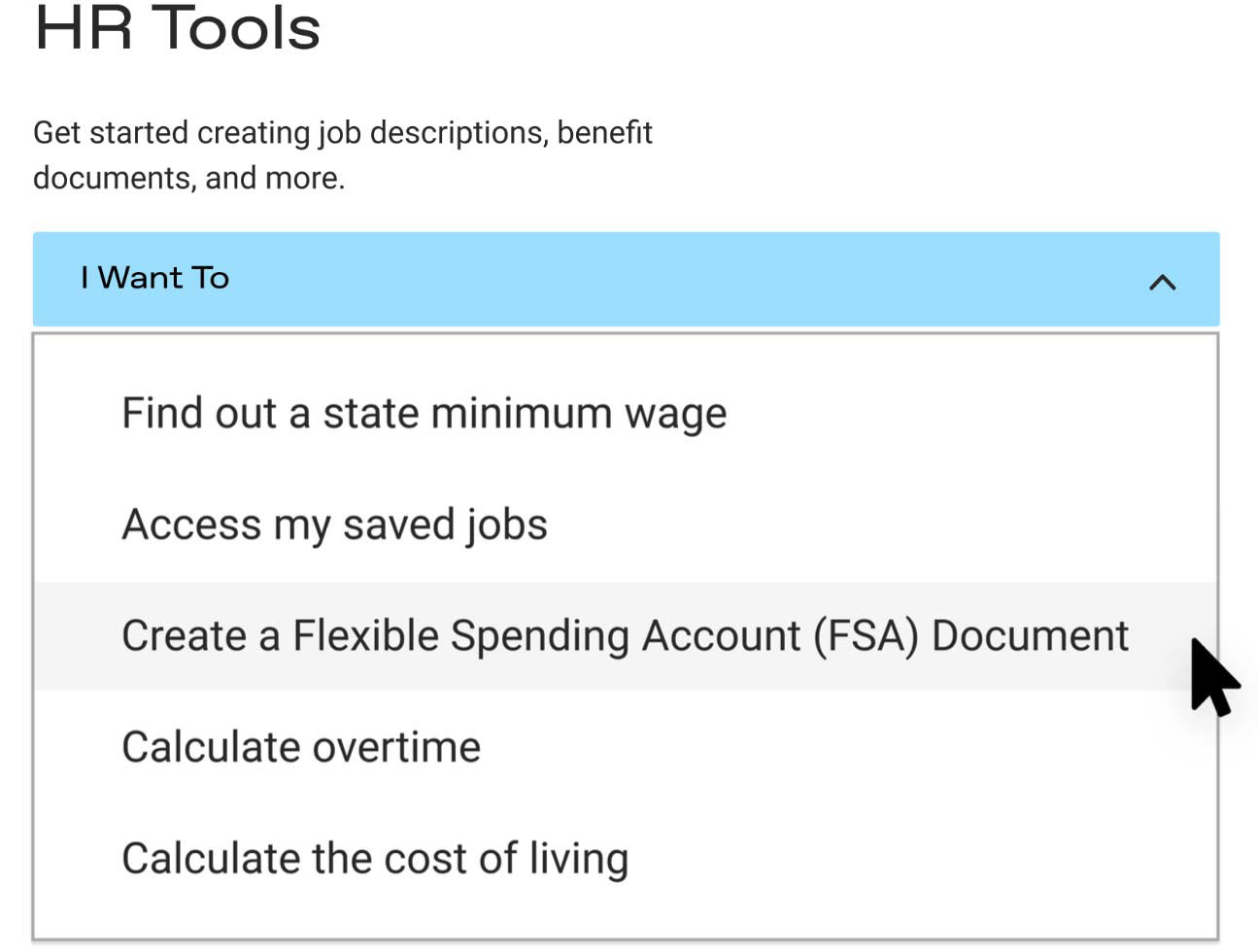

#4 - Add Clear Feature Descriptions for New Users
For many users, this may be their "unboxing" moment. Provide concise, strategic descriptions that clearly explain each feature's purpose and functionality within the HR platform.
Contextualize the Feature
Describe what the feature is and what users can expect to find inside.
Use Text Links
Enable users to quickly access more information or navigate directly to the feature.
Describe what the feature is and what users can expect to find inside.
Use Text Links
Enable users to quickly access more information or navigate directly to the feature.
Boost Discoverability
Treat this as an introduction to key product features, improving clarity and find-ability for new users.
Treat this as an introduction to key product features, improving clarity and find-ability for new users.
By offering clear, helpful descriptions, we ensure users can easily understand the platform’s capabilities and make the most of its tools from the start.
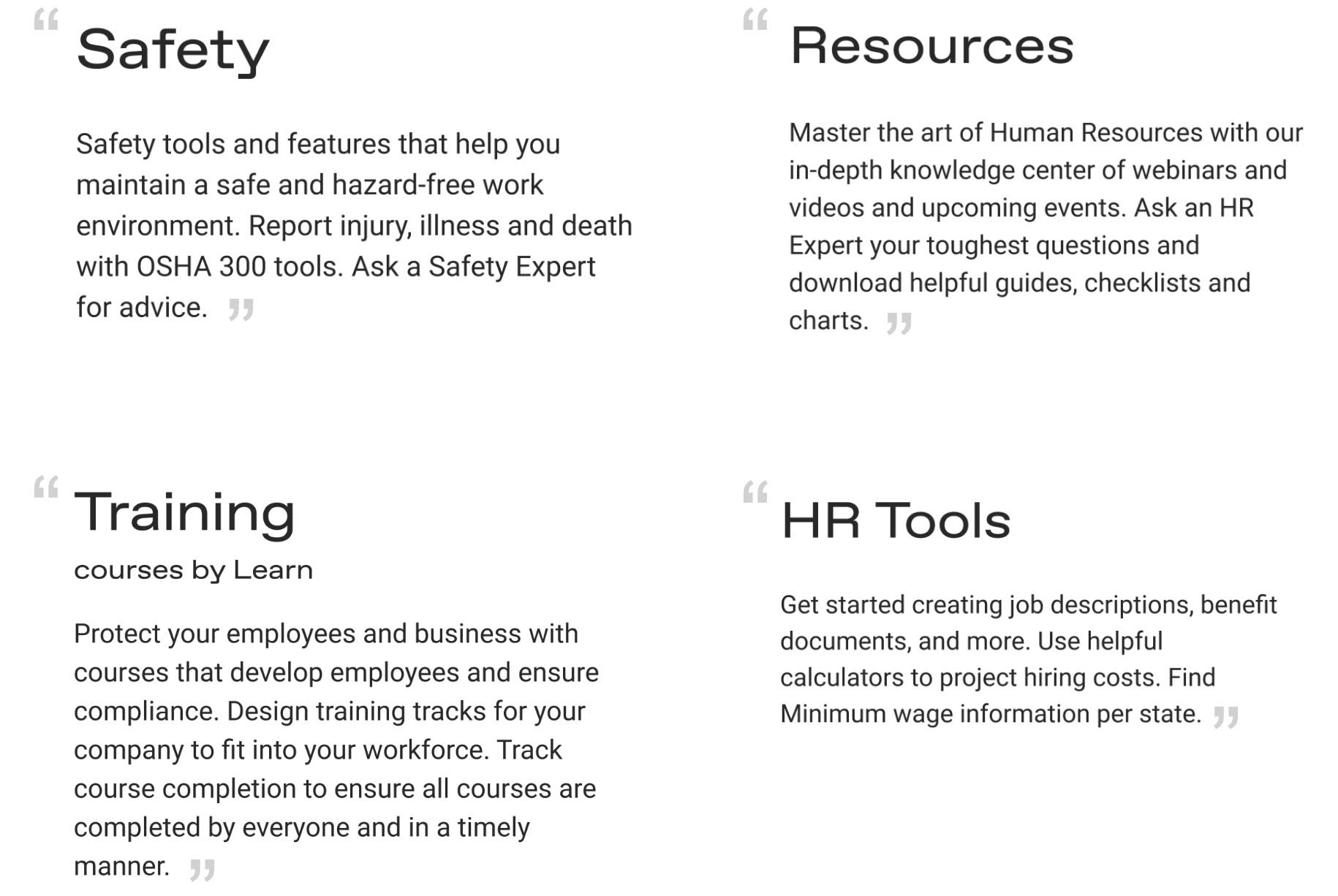

#5 - Tailor UI for Returning Users
Help returning users quickly resume tasks by surfacing recent activity and relevant content. A few opportunities for this include...
Recent Items
Display previously edited, created, or viewed content based on user interactions.
Display previously edited, created, or viewed content based on user interactions.
Fallback to Popular Content
When user data isn’t available, highlight frequently accessed or popular items.
When user data isn’t available, highlight frequently accessed or popular items.
Quick Access Cards
Feature popular actions or content on landing pages, giving users easy entry points.
Feature popular actions or content on landing pages, giving users easy entry points.
This approach streamlines the experience for returning users, reducing friction and ensuring they can effortlessly pick up where they left off.
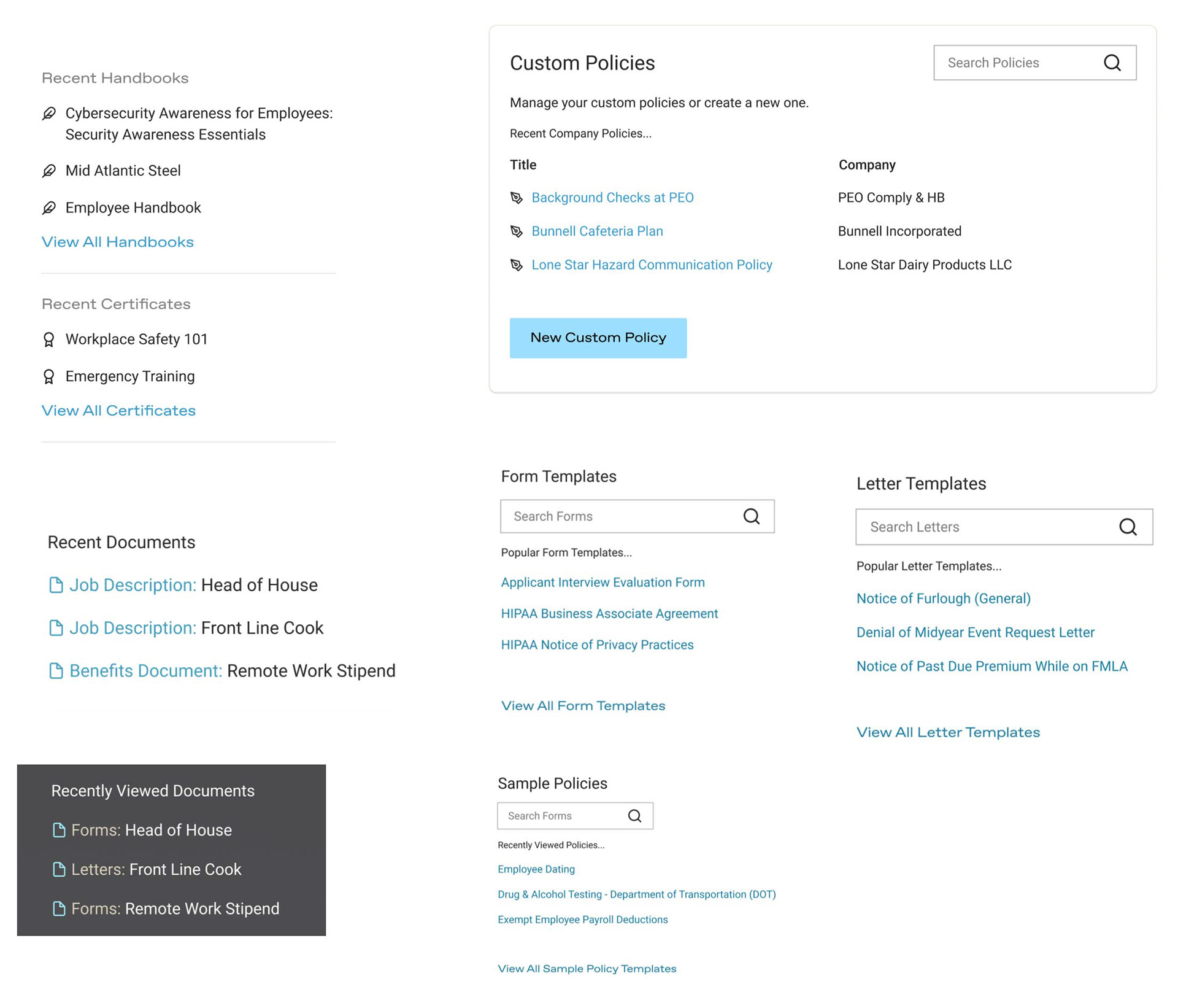

Takeaways
This project was a big pitch to stakeholders. Since there was a Product Manager for each feature, I needed to gain alignment one by one. My time came to an end before I saw this through but I was able to share potential designs of the outcome.
Screenshots
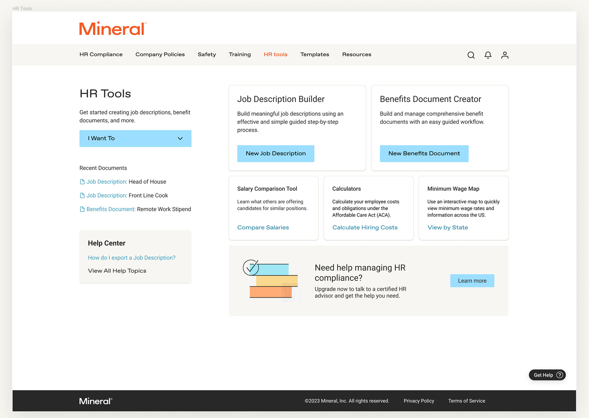
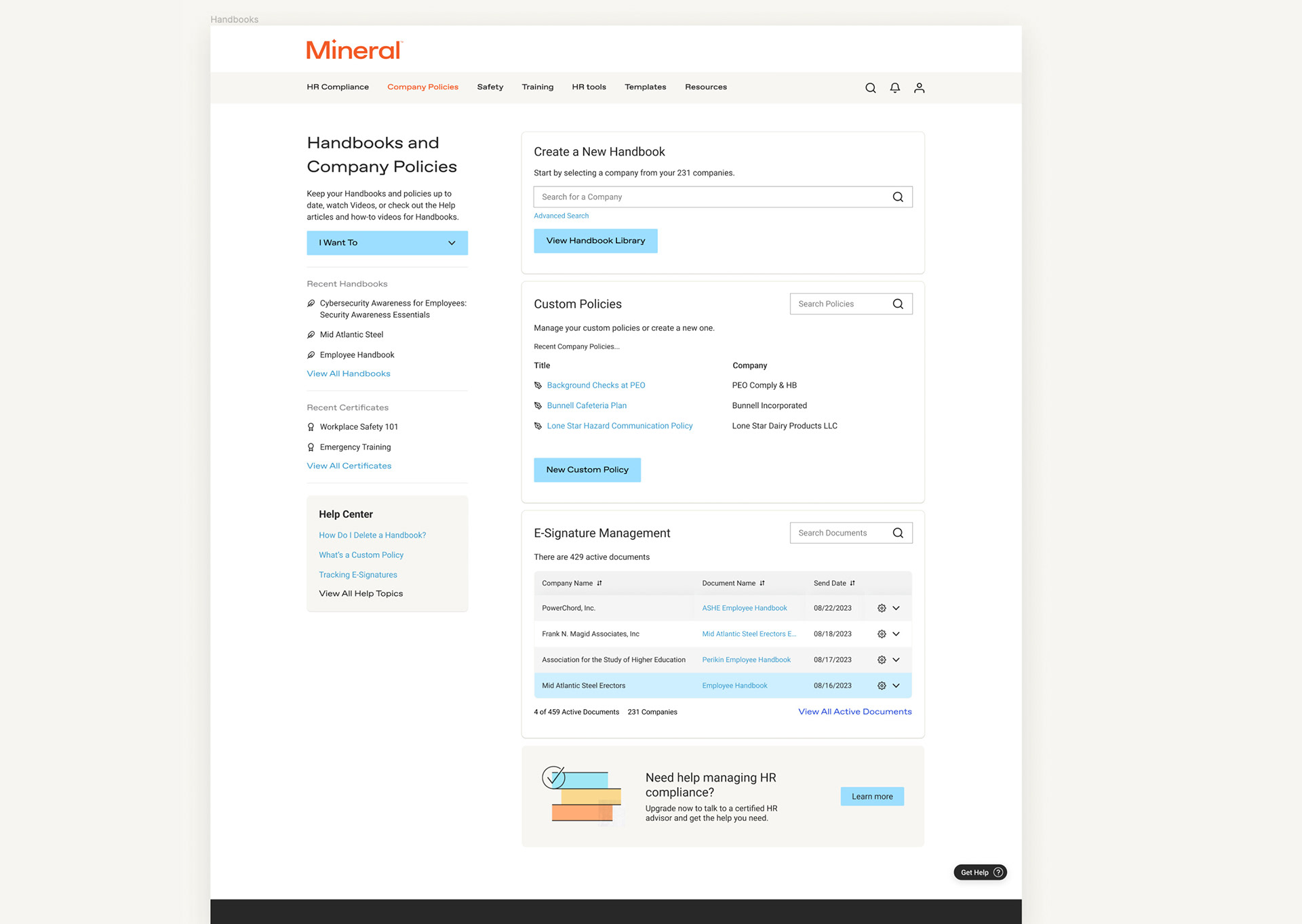
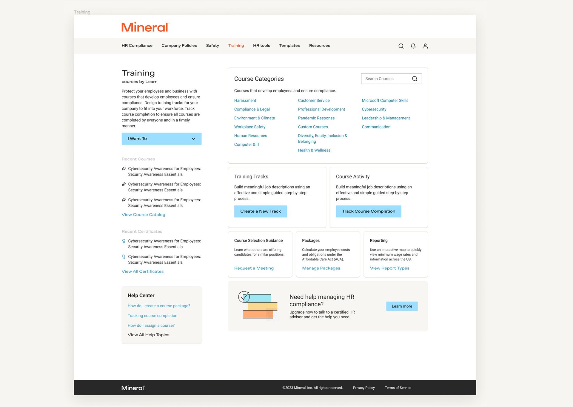
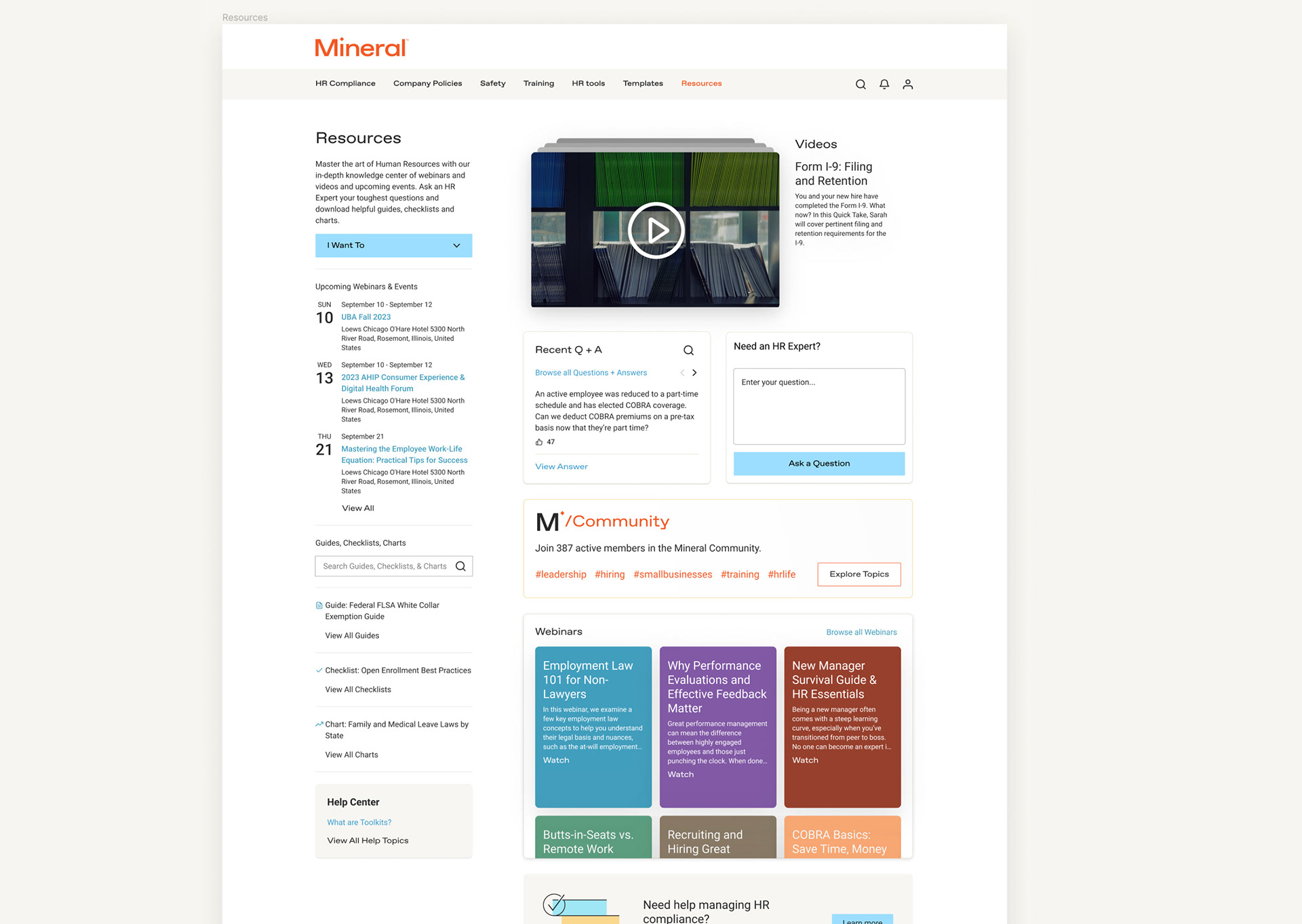
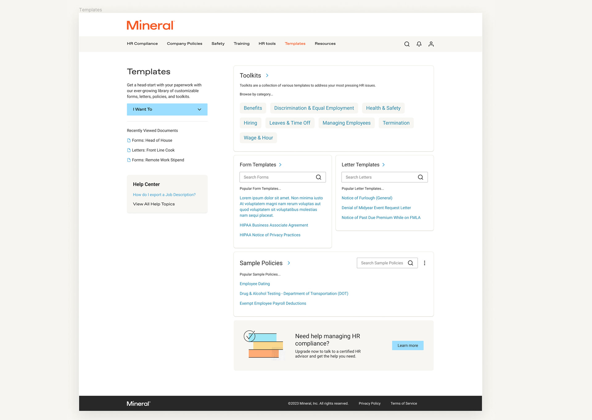
Above: Image gallery of proposed designs, as examples, to show a unified template experience.
•••
Project Summary of Responsibilities
Discovery
Understanding user feedback.
Grouping and identifying a strategy.
Planning
Share presentation and promote design strategy with stakeholders.
Design
Loose, High fidelity designs of large concepts.